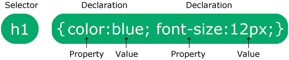
CSS Notes

CSS stands for Cascading Style Sheets.
CSS is the language we use to style an HTML document.
CSS describes how HTML elements should be displayed.
file extension - .css and many other.

CSS Syntax

A CSS rule consists of a selector and a declaration block.
css syntax
Example:-
                p {
                    color: red;
                    text-align: center;
                }
            
Example Explained
p is a selector in CSS (it points to the HTML element you want to style: <p>).
color is a property, and red is the property value
text-align is a property, and center is the property value

CSS Selectors:-

A CSS selector selects the HTML element(s) you want to style.
We can divide CSS selectors into five categories:

Universal Selector:-

The universal selector (*) selects all HTML elements on the page.
e.g - * { text-align: center; color: blue;}

Element Selector:-

The element selector selects HTML elements based on the element name.
also we can select multiple different elements by using comma.
e.g - h1, p { text-align: center; } - here all h1 and p tags are selected.

ID Selector:-

The id of an element is unique within a page.
id is case sensitive.
Note: An id name cannot start with a number!
so the id selector is used to select one unique element!
write a hash (#) character, followed by the id of the element.
e.g #elementid { text-align: center; }

Class Selector:-

Multiple HTML elements can share the same class.
Also one element have more than one classes.
Note: A class name cannot start with a number!
e.g <p class="center large">...</p> - have two classes center and large.
The class selector selects HTML elements with a specific class attribute.
To select elements with a specific class, write a period (.) character, followed by the class name.
e.g - .center {text-align: center; color: red;}
You can also specify that only specific HTML elements should be affected by a class.
e.g - p.center { text-align: center; color: red; }
In this example only <p> elements with class="center" will be affected

attribute Selector:-

The [attribute] selector is used to select elements with a specified attribute.
e.g - a[target] { background-color: yellow; } - selects all a elements with a target attribute.

[attribute="value"] Selector:-

The [attribute="value"] selector is used to select elements with a specified attribute and value.
e.g - a[target="_blank"] { background-color: yellow; } - selects all a elements with a target="_blank" attribute.

Pseudo class:-

A pseudo-class is used to define a special state of an element.
syntax: selector:pseudo-class { property: value; }
e.g - a:hover { color: #FF00FF; }

different pseudo-classes
Pseudo-class example example description
:hover a:hover Selects element on mouse over
:active a:active Selects the active link
:checked option:checked Matches any option element that is checked
:nth-of-type() p:nth-of-type(2n) Selects any p element that is the even p element of its parent
Many many more pseudo classes also there that we can learn

Pseudo-elements:-

A CSS pseudo-element is used to style specific parts of an element.
syntax - selector::pseudo-element { property: value; }
e.g - p::first-line { color: #ff0000; }

different pseudo-elements
Pseudo-element Example Example description
::first-letter p::first-letter Selects the first letter of every p element
::first-line p::first-line Selects the first line of every p element
::selection p::selection Styles the user-selected text inside any p tag
Many many more pseudo elements also there that we can learn

CSS Combinators:-

A CSS selector can contain more than one simple selector. Between the simple selectors, we can include a combinator.

Descendant Combinator(space):-

The descendant combinator matches all elements that are descendants of a specified element.
e.g - div p { background-color: yellow; } - selects all <p> elements inside <div> elements

Next Sibling combinator (+):-

The next sibling combinator is used to select an element that is directly after another specific element.
Sibling elements must have the same parent element(means same level).
e.g - div + p { background-color: yellow; } - selects the first <p> element that are placed immediately after <div> elements

Child combinator (>):-

The child combinator selects all elements that are the children of a specified element.
e.g - div > p { background-color: yellow; } - selects all <p> elements that are children of a <div> element

Cascade in CSS:-

Cascading in CSS determines which rule to apply when multiple rules target the same element.
these rules are also works when there many style sheets.
The browser resolves conflicts based on:

  1. Rules marked with !important override everything. Regardless of where they are declared.
  2. Inline styles (e.g., style="...") have the highest priority if no !important is involved..
  3. Specificity determines which rule takes precedence if there's no !important.
  4. If specificity is the same, the last declared rule is applied.

Specificity:-

Specificity in CSS is a system used to determine which CSS rule should be applied to an element when multiple rules target the same element.
The higher the specificity value, the more priority the rule has over others.
Specificity is calculated using a four-part system, where each part is represented by a number that reflects the importance of different types of selectors.
These parts are:

  1. Inline styles: (1000)
  2. ID selectors: (100)
  3. Class selectors, attributes, and pseudo-classes: (10)
  4. Element selectors and pseudo-elements: (1)
e.g -
#header { color: blue; } - Specificity 100
.menu { color: green; } - Specificity 10
div { color: yellow; } - Specificity 1
#header { color: red; } - Specificity 100, but declared later (wins)
The result will be red
Add up the specificity for all components of the selector.
if two rules have the same specificity, the one declared last wins.

!important:-

The !important rule in CSS is used to add more importance to a property/value than normal.
it will override ALL previous styling rules for that specific property on that element!
e.g - p { background-color: red !important; }
do not use it unless you absolutely have to.

Inheritance:-

Inheritance in CSS means that some properties automatically pass their values from parent elements to child elements.

Properties that inherit by default:

Some CSS properties inherit their values automatically. These are typically text- and font-related properties, such as:
color, font-family, font-size, font-style, letter-spacing, line-height, visibility e.t.c

Properties that do not inherit by default:

Most other CSS properties, especially box model properties and layout-related properties, do not inherit by default, such as:
margin, padding, border, width, height, background, display e.t.c

Forcing inheritance:-

You can force a property to inherit its value using the inherit keyword. For example:
p { color: inherit; } - Takes the color from its parent.

Overriding inheritance:-

Child elements can override inherited values with their own specified styles.

Default (initial) value:-

If you want to reset a property to its default value (as defined by the CSS specification), you can use the initial keyword:
p { color: initial; }

Universal inheritance (using all):-

The all shorthand property can be used to apply inherit, initial, or unset to all properties:
e.g - div {all: inherit; } - Forces all properties to inherit.

How to use:-

There are three ways of inserting a style sheet:

External CSS

With an external style sheet, you can change the look of an entire website by changing just one file!
External styles are defined within the <link> element, inside the <head> section
Most used as we can use a single file for multiple pages.
e.g - <head> <link rel="stylesheet" href="cssfilename.css"> </head>
write full path of file if not in same folder.

Internal CSS

The internal style is defined inside the <style> element, inside the head section.
Not used because for every html file we have to style again and again.
            <head>
                <style>
                body {
                  background-color: black;
                }
                </style>
            </head>
            

Inline CSS

An inline style may be used to apply a unique style for a single element.
To use inline styles, add the style attribute to the relevant element that can contain any CSS property.
e.g - <h1 style="color:blue; text-align:center;">This is a heading</h1>
Not used because every element we have to style again and again.

Note - If some properties have been defined for the same selector (element) in
different style sheets, the value from the last read style sheet will be used.

color property:-

The color property specifies the color of text(or foreground).
e.g - body {color: red;}

background-color property:-

The background-color property sets the background color of an element.
The background of an element is the total size of the element, including padding and border (but not the margin).

font-size property:-

The font-size property sets the size of a font.
values - medium(default), small, large, smaller, larger, length, %.
smaller and larger are relative to parent.

background-image property:-

The background-image property specifies an image to use as the background of an element.
syntax - background-image: url("path/link"); e.g - background-image: url("paper.gif");
By default, the image is repeated so it covers the entire element.

background-size property:-

The background-size property specifies the size of the background images.
e.g - background-size: cover;(best, we are using it mostly) or background-size: 75% 50% e.t.c

values
auto Default value. The background image is displayed in its original size
length Sets the width and height of the background image.first value sets width, second value sets height. If only one value, the second is set to "auto".
cover Resize the background image to cover the entire container, even if it has to stretch the image or cut a little bit off one of the edges
contain Resize the background image to make sure the image is fully visible

Color System:-

Named Colors:-

a color can be specified by using a predefined color name.
CSS/HTML support ~140 standard color names.

RGB Colors:-

a color can be specified as an RGB value, using this formula:
rgb(red, green, blue)
Each parameter (red, green, and blue) defines the intensity of the color between 0 and 255.

RGBA Colors:-

RGBA color values are an extension of RGB color
values with an alpha channel - which specifies the opacity for a color.
rgba(red, green, blue, alpha)
alpha parameter is a number between 0.0 (fully transparent) and 1.0 (not transparent at all).

HEX(hexadecimal) Colors:-

a color can be specified using a hexadecimal value in the form:
#rrggbb
Where rr (red), gg (green) and bb (blue) are hexadecimal values between 00 and ff (same as decimal 0-255).
The 3-digit hex code is a shorthand for some 6-digit hex codes. - #rgb
e.g - if we have #ff00cc, it can be written like this: #f0c.
#rrggbbaa - aa is for alpha channel range from 00(fully transparent) to ff(fully visible).
it does not affect the transparency of the element's content.

Opacity property:-

The opacity property in CSS is used to control the transparency level of an element.
It accepts values between 0 (completely transparent) and 1 (completely opaque).
e.g - opacity: value;
Note - opacity applies to both the element and its children.
To make only the background transparent while keeping child elements opaque, you can use color with alpha value for the background color.

Text properties:-

text-align property:-

The text-align property specifies the horizontal alignment of text in an element.
Aligns according to parent element.

left/start Aligns the text to the left /
from starting side according to different languages
right/end Aligns the text to the right /
from ending side according to different languages
center Centers the text
justify Stretches the lines so that each line has equal width
(like in newspapers and magazines)

font-weight property:-

The font-weight property sets how thick or thin characters in text should be displayed.
values - 100-900, normal, bold, bolder, lighter. 400 is the same as normal, and 700 is the same as bold.
bolder and lighter are according to parent.

text-decoration property:-

The text-decoration property specifies the decoration added to text, and is a shorthand property for:
text-decoration-line (required), text-decoration-color, text-decoration-style, text-decoration-thickness.
syntax - text-decoration: text-decoration-line; text-decoration-color; text-decoration-style; text-decoration-thickness;
Default value: none currentColor solid auto

Values:-
text-decoration-line none, underline, overline, line-through
text-decoration-color Sets the color of the text decoration
text-decoration-style solid, wavy, dotted, dashed, double
text-decoration-thickness Sets the thickness of the decoration line

also can be used to remove underline of anchor tag e.t.c by using value none.

line-height property:-

The line-height property specifies the height of a line.
Note: Negative values are not allowed.

line-height values:-
normal A normal line height. This is default
number A number that will be multiplied with the current font-size to set the line height
e.g - 2,3.5 e.t.c
length A fixed line height in px, pt, cm, etc
% line height in percent of the current font size

letter-spacing property:-

The letter-spacing property increases or decreases the space between characters in a text.

letter-spacing values:-
normal default,Defines normal space
length Defines a length that is used as the space between characters
(negative values are also allowed).
e.g - 10px e.t.c

Units in css:-

CSS has several different units for expressing a length.
Many CSS properties take "length" values, such as width, margin, padding, font-size, etc.
Length is a number followed by a length unit, such as 10px, 2em, etc.
Note: A whitespace cannot appear between the number and the unit.if the value is 0, the unit can be omitted.
For some CSS properties, negative lengths are allowed.
two types of length units: absolute and relative.

Absolute Lengths:-

The absolute length units are fixed and a length expressed in any of these will appear as exactly that size.

Unit Description
px pixels (1px = 1/96th of 1in)
mm milimeters
in inches (1in = 96px = 2.54cm)
cm centimeters
pt points (1pt = 1/72 of 1in)
pc picas (1pc = 12 pt)

Relative Lengths:-

Relative length units specify a length relative to another length property.

Unit Description
% Relative to the parent element
em Relative to the font-size of the element
(2em means 2 times the size of the current font)
rem Relative to font-size of the root element
ch Relative to the width of the "0" (zero)
vh Relative to 1% of the height of the viewport
vw Relative to 1% of the width of the viewport
many more...

Tip: The em and rem units are practical in creating perfectly scalable layout!
Viewport = the browser window size. If the viewport is 50cm wide, 1vw = 0.5cm.

% - The percentage unit (%) in CSS is relative to its parent element's dimensions. For width and height, it depends on the parent's width or height, while for padding and margin, it's based on the parent's width. Font sizes use the parent's font size, and positioning (top, left, etc.) is relative to the containing block's dimensions.

em - Relative to Font size of the parent, in the case of typographical properties like font-size, and font size of the element itself, in the case of other properties like width.
drawback - Because em is relative, nested elements can multiply the size effect if their parents also use em (Compounding effect or Snowball effect in nested elements).

rem - Relative to font size of root element. Easy to adjust entire layouts by changing the root font size. Avoids compounding effects seen with em.

font-family property:-

The font-family property specifies the font for an element.
The font-family property can hold several font names.
If the browser does not support the first font, it tries the next font.
family-name - The name of a font-family, like "times", "courier", "arial", etc.
generic-family - The name of a generic-family, like "serif", "sans-serif", "cursive", "fantasy", "monospace".
Start with the font you want, and always end with a generic family
Note: Separate each value with a comma.
If a font name contains white-space, it must be quoted.

Box Model:-

All HTML elements can be considered as boxes.
The CSS box model is essentially a box that wraps around every HTML element. It consists of: content, padding, borders and margins.
box model img
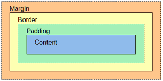
Content - The content of the box, where text and images appear
Padding - Clears an area around the content. The padding is transparent
Border - A border that goes around the padding and content
Margin - Clears an area outside the border. The margin is transparent

height property:-

The height property sets the height of an element.
The height of an element does not include padding, borders, or margins.
If height: auto; the element will automatically adjust its height to allow its content to be displayed correctly.
values - auto, length, %, initial, inherit.

width property:-

The width property sets the width of an element.
The width of an element does not include padding, borders, or margins.
values - auto, length, %, initial, inherit.

Border:-

The border property in CSS is used to add a visible line (border) around an HTML element.
You can customize its width, style, and color.
shorthand - border: width style color;
we can control each side of the border independently:-
border-top: width style color; (same for all other), border-right, border-bottom, border-left.

border-width property:-

The border-width property specifies the width of the four borders.
The width can be set as a specific size (in px, pt, cm, em, etc) or
by using one of the three pre-defined values: thin, medium, or thick. specific side widths:-
The border-width property can have from one to four values (for the top border, right border, bottom border, and the left border)
e.g if 2 values - border-width: 5px 20px; - 5px top and bottom, 20px on right and left.
e.g if 4 values - border-width: 25px 10px 4px 35px; - 25px top, 10px right, 4px bottom and 35px left.
shorthand syntax - border-width: top right bottom left;
or we can use - border-top-width, border-right-width, border-bottom-width, border-left-width.

border-style property:-

The border-style property sets the style of an element's four borders.
if 4 values - top, right, bottom, left,;
if 3 values - top, right and left, bottom,
if 2 values - top and bottom, right and left.
if 1 value - all four borders same.
values - none, hidden, dotted, dashed, solid, double, groove, ridge, inset, outset, initial, inherit.

border-color property:-

The border-color property is used to set the color of the four borders.
Note: If border-color is not set, it inherits the color of the element.
shorthand - border-color: top right bottom left;
also on specific sides - border-top-color, border-right-color, border-bottom-color, border-left-color.

border-radius property:-

The border-radius property is used to add rounded borders to an element.
shorthand - border-radius: top-left top-right bottom-right bottom-left
there are also many more shorthand types.
also we can assign to single border-top-left-radius, border-bottom-left-radius, border-bottom-right-radius, border-top-right-radius.
to make circle border-radius: 50%; and height,width need to same otherwise oval shape.

box-shadow property:-

The box-shadow property attaches one or more shadows to an element.
syntax - box-shadow: h-offset v-offset blur color; , e.g- box-shadow: 10px 10px 8px #888888;
also - box-shadow: h-offset v-offset blur spread color inset;
To attach more than one shadow to an element, add a comma-separated list of shadows

values
none Default value. No shadow is displayed
h-offset Required. The horizontal offset of the shadow. A positive value puts shadow on right side of the box, negative value on the left
v-offset Required. The vertical offset of the shadow. A positive value puts the shadow below the box, negative value puts shadow above
blur Optional. The blur radius. The higher the number, the more blurred the shadow will be
spread Optional. The spread radius.
color Optional. The color of the shadow. The default value is the text color.
inset Optional. Changes the shadow from an outer shadow (outset) to an inner shadow

padding property:-

Padding is used to create space around an element's content, inside of any defined borders.
shorthand:-
if 4 values - top, right, bottom, left,;
if 3 values - top, right and left, bottom,
if 2 values - top and bottom, right and left.
if 1 value - all four borders same.
e.g - padding: 10px 20px 30px 40px;
also for individual - padding-top, padding-right, padding-bottom, padding-left.

margin property:-

Margins are used to create space around elements, outside of any defined borders.
shorthand - margin: top right bottom left; or with 3,2,1 values also.
also we can set individual - margin-top, margin-right, margin-bottom, margin-left.
values - length, %, 0, auto, initial, inherit. and for approx all above box model properties.

display property:-

The display property in CSS is used to specify the display behavior of an element.
It determines how an element is rendered in the document flow.

display property values
Value Discription
none The element is completely removed
inline Displays an element as an inline element (like span). but Any height and width properties will have no effect. This is default.
block Displays an element as a block element (like p). It starts on a new line, and takes up the whole width
inline-block Combines the features of inline and block. It flows inline but allows setting width and height.
flex Displays an element as a block-level flex container
inline-flex Displays an element as an inline-level flex container
grid Displays an element as a block-level grid container
inline-grid Displays an element as an inline-level grid container
initial, inherit, e.t.c many many more...

When an element has display: inline, none, or contents, properties like height, width,
and vertical margins (margin-top and margin-bottom) have no effect because inline elements
rely on their content size, none removes the element from rendering, and contents makes the
element visually disappear while only showing its children.

Inline v/s block
Inline Block
Do not start on a new line Always start on a new line
Only use as much horizontal space as required by the content.
Do not accept width and height CSS properties
Take up as much horizontal space as possible
(the full width of the container or browser window if there is no container)
Margins will work horizontally, but not vertically. Will respect width and height CSS properties.
Padding works on all sides, but the top and bottom may overlap other elements. Horizontal and vertical margins both work

transition property:-

Transitions enable you to define the transition between two states of an element.
To create a transition effect, you must specify two things: the CSS property you want to add an effect to, the duration of the effect.
Note: If the duration part is not specified, the transition will have no effect, because the default value is 0.
we can add transition effect to many elements is same property e.g - transition: width 2s, height 4s;
syntax(shorthand) - transition: transition-property transition-duration transition-timing-function transition-delay

transition-property property:-

The transition-property property specifies the name of the CSS property the transition effect is for.
Default value: all, Inherited: no.
values - none, all, property, initial, inherit. e.g - div { transition-property: width; } , div:hover { width: 300px; } - Hover over a div element, and change the width with a transition effect.

transition-duration property:-

The transition-duration property specifies how many seconds (s) or milliseconds (ms) a transition effect takes to complete.
Default value: 0s, Inherited: no.
values - time, initial, inherit.
transition-duration: 5s; - Let the transition effect last for 5 seconds.

transition-timing-function:-

The transition-timing-function property specifies the speed curve of the transition effect.
Default value: ease, Inherited: no.

values
Value Description
ease Default value. Specifies a transition effect with a slow start, then fast, then end slowly
linear Specifies a transition effect with the same speed from start to end
ease-in Specifies a transition effect with a slow start
ease-out Specifies a transition effect with a slow end
ease-in-out Specifies a transition effect with a slow start and end
and many more values also there.

transition-delay property:-

The transition-delay property specifies when the transition effect will start.
Value is defined in seconds (s) or milliseconds (ms).
Default value: 0s, Inherited: no
e.g - transition-delay: 2s; - Wait 2 seconds before the transition effect starts.

transform property:-

The transform property in CSS allows you to apply transformations to elements, such as scaling, rotating, translating, or skewing them.
values: none, transform-functions;
we can use multiple properties in single by using space - {transform: translate(200px,200px) rotate(90deg)};

transform-functions:-

rotate(angle):-

Rotates the element clockwise or counterclockwise.
e.g - transform: rotate(180deg);
also we can give angle in negative and in other units.

scale(x,y):-

Scales the element by the specified x and y factors.
e.g - transform: scale(1.5, 2);
also there we can use scaleX, scaleY
also shorthand scale(value) - same value for all direction.

translate(x, y):-

Moves the element from its original position.
e.g - transform: translate(50px, 100px);
also there we can use translateX, translateY
also accept negative values.

skew(x,y):-

Skew applies a slanting transformation to an element along the x-axis and y-axis.
e.g - transform: skew(30deg,60deg); , if one value skew(30deg) = skew(30deg,0deg) - but not use like this.
also skewX(),skewY().
also accept negative values.

position property:-

The position property specifies the type of positioning method used for an element (static, relative, fixed, absolute or sticky).
Elements are then positioned using the top, bottom, left, and right properties.
However, these properties will not work unless the position property is set first. They also work differently depending on the position value.

position: static;

HTML elements are positioned static by default.
Static positioned elements are not affected by the top, bottom, left, and right properties.
An element with position: static; is not positioned in any special way; it is always positioned according to the normal flow of the page:

position: relative;

An element with position: relative; is positioned relative to its normal position.
Setting the top, right, bottom, and left properties of a relatively-positioned element will cause it to be adjusted away from its normal position.
Other content will not be adjusted to fit into any gap left by the element.

position: fixed;

An element with position: fixed; is positioned relative to the viewport, which means it always stays in the same place even if the page is scrolled.
The top, right, bottom, and left properties are used to position the element.
A fixed element does not leave a gap in the page where it would normally have been located.

position: absolute;

An element with position: absolute; is positioned relative to the nearest positioned ancestor (instead of positioned relative to the viewport, like fixed).
If an absolutely positioned element has no ancestor with a defined positioning context (i.e., relative, absolute, or fixed), it will use the document body as its reference point. Consequently, the element's position will be calculated relative to the entire page, and it will move along with the content when the page is scrolled.
Note: Absolute positioned elements are removed from the normal flow(other elements take their place), and can overlap elements.

position: sticky;

An element with position: sticky; is positioned based on the user's scroll position.
A sticky element toggles between relative and fixed, depending on the scroll position. It is positioned relative until a given offset position is met in the viewport - then it "sticks" in place (like position:fixed).
Note: You must specify at least one of top, right, bottom or left for sticky positioning to work.
e.g - div.sticky { position: sticky; top: 0;}

Flexbox:-

Flexbox is short for the Flexible Box Layout module.
Flexbox is a layout method for arranging items in rows or columns.
Flexbox makes it easier to design a flexible responsive layout structure, without using float or positioning.
To start using CSS Flexbox, you need to first define a flex container.
The flex container becomes flexible by setting the display property to flex.
Direct child of flex container become flex items.

flex-direction property:-

The flex-direction property specifies the direction of the flexible items.
Note: If the element is not a flexible item, the flex-direction property has no effect.

values
row Default value. The flexible items are displayed horizontally, as a row
row-reverse Same as row, but in reverse order
column The flexible items are displayed vertically, as a column
column-reverse Same as column, but in reverse order
Initial, Inherit

justify-content property:-

The justify-content property aligns the flexible container's items when the items do not use all available space on the main-axis (horizontally).

values
flex-start Default value. Items are positioned at the beginning of the main-axis
flex-end Items are positioned at the end of the main-axis
center Items are positioned in the center of the main-axis
space-between Items will have space between them
space-around Items will have space before, between, and after them. In before and after space are half than at between
space-evenly Items will have equal space around them
Initial, Inherit

flex-wrap property:-

The flex-wrap property in CSS is used to control whether the flex items should wrap onto multiple lines when there isn't enough space in the flex container.
This property is particularly useful for creating responsive layouts and managing content overflow.

values
nowrap Default value. Specifies that the flexible items will not wrap
wrap Specifies that the flexible items will wrap if necessary
wrap-reverse Specifies that the flexible items will wrap, if necessary, in reverse order
Initial, Inherit

align-items property:-

The align-items property is used to align the flex items when they do not use all available space on the cross-axis (vertically).

values
flex-start Aligns flex items to the start of the cross axis.
flex-end Aligns flex items to the end of the cross axis.
center Aligns flex items to the center of the cross axis.
stretch (default).Stretch is the default behavior. Flex items are stretched to fill the entire container along the cross axis.
baseline Aligns flex items such that their baselines (the bottom of their content) are aligned.
This is useful when items have different heights but you want their content to align along a common baseline.
normal similar to stretch
Initial, Inherit

align-content property:-

The align-content property specifies how flex lines are distributed along the cross axis in a flexbox container.

values
stretch Default value.It stretches the lines of items to fill the container along the cross axis
center This aligns all the flex lines to the center of the container along the cross axis, leaving equal space above and below the lines.
flex-start This aligns all the flex lines to the start of the container along the cross axis.
flex-end This aligns all the flex lines to the end of the container along the cross axis.
space-between This distributes the flex lines with equal space between them, but no space before the first line or after the last line.
space-around Items will have space before, between, and after them. In before and after space are half than at between
space-evenly This distributes the flex lines with equal space between, before, and after them,

align-self property:-

While the align-items property sets alignment for all items within the container, align-self can target individual items along the cross axis.
align-self has higher priority than > align-items.

values
auto (default). Inherits the value of the align-items property. If align-items is not defined, the default behavior is stretch.
flex-start Aligns the item at the start of the cross axis.
flex-end Aligns the item at the end of the cross axis.
center Aligns the item at the center of the cross axis.
baseline Aligns the item based on the baseline of its text.
stretch (default for most items).Stretches the item to fill the container along the cross axis (only if the item's size is auto for that axis).

order property:-

The order property specifies the order of a flexible item relative to the rest of the flexible items inside the same container.
value - number(Default value 0. Specifies the order for the flexible item)

Flex Sizing:-

flex-basis property:-

The flex-basis property specifies the initial length of a flexible item (along main axix).
values - length, percentage, auto(Default value. The size of the item is determined by its content or width/height properties if specified.), initial, inherit.
If flex-basis is set, it overrides the width or height properties of the flex item for the initial sizing in the flex container.

flex-grow property:-

flex-grow is a CSS property that specifies how much a flex item will grow relative to the other flex items inside a flex container when there is extra space available(along main axis).
It determines the proportion of the free space allocated to the item.
value - number(how many times e.g - 0.5, 4, 2 e.t.c - 2 means two times), initial, inherit.
default value - 0 (extra space remains unused)
e.g - .item1 { flex-grow: 1; - Grows equally } .item2 { flex-grow: 2; - Grows twice as much as item1 }

flex-shrink property:-

flex-shrink is a CSS property that specifies how much a flex item will shrink relative to the other flex items in a flex container when there is not enough space (along main axis).
It determines the proportion of space a flex item gives up when the container size is reduced.
value - number
if value 0: The item will not shrink, even if there isn’t enough space.
if value 1: The item will shrink in proportion to others with the same shrink factor.
if value 2: The item will shrink twice as much as items with flex-shrink: 1. e.t.c

flex property:-

The flex property is a shorthand CSS property used to set the flex-grow, flex-shrink, and flex-basis properties of a flex item in a single declaration.
if 3 values - flex: flex-grow | flex-shrink | flex-basis - e.g - flex: 2 2 100px;
if 2 values(one with unit) - flex: flex-grow | flex-basis - e.g - 2 100px;
if 2 values(both unitless) - flex: flex-grow | flex-shrink - e.g - 2 1;
if 1 value(unitless) - flex: flex-grow - e.g - flex: 1;
if 1 value(with unit) - flex: flex-basis - e.g - flex: 10px;

Grid:-

CSS Grid is a powerful layout system in CSS that allows you to create two-dimensional layouts for web pages.
It works by defining a grid container and placing child elements (grid items) within it.
Grid Container: The parent element with display: grid or display: inline-grid.
Grid Items: The direct children of the grid container.

Grid Model:-

Grid Lines - The dividing lines (both horizontal and vertical) that separate the grid into rows and columns.
Grid Track - The space between two adjacent grid lines, which can be either a row or column track.
Grid Cell - The smallest unit of the grid, defined by the intersection of a single row track and a single column track,where an item can be placed.
Gridlayout

grid-template-columns property:-

The grid-template-columns property specifies the number (and the widths) of columns in a grid layout.
The values are a space separated list, where each value specifies the size of the respective column.
grid-template-columns: 30px 200px auto 100px; - 4 values means 4 columns.

values
none Default value. Columns are created if needed
auto The size of the columns is determined by the size of the container and on the size of the content of the items in the column
length Sets the size of the columns, by using a length value.
repeat() Repeats a set of rows in the grid(used to divide all space available)
repeat(count, track-size);
count: The number of times the pattern should repeat.
track-size: fr,%,length,auto e.t.c.
e.g - grid-template-column: repeat(3, 1fr); == grid-template-column: 1fr 1fr 1fr - it equally divides
If you use 2fr instead of 1fr, it means the row (or column) will take twice the amount of available space compared to other tracks that use 1fr e.t.c.
many many more....

grid-template-rows property:-

The grid-template-rows property specifies the number (and the heights) of the rows in a grid layout.
The values are a space-separated list, where each value specifies the height of the respective row.
grid-template-rows: 100px auto 300px; - 3 values means 3 rows
values - see grid-template-columns values table same as there just replace column with row.
if height and width of elements is not set then they take full space of grid cell.

grid-gap property:-

row-gap -> controls the vertical space (space between rows) in the grid.
e.g - row-gap: 30px;

column-gap -> column-gap controls the horizontal space (space between columns) in the grid.
column-gap: 20px;

grid-gap -> grid-gap (or gap) is a shorthand property that sets both row-gap and column-gap at the same time.
e-g - grid-gap: rowGap columnGap OR grid-gap: forboth
e.g - grid-gap:10px 20px, also we can use just gap:10px 20px
e.g - grid-gap:10px or gap:10px - set 10px for both row and column gap.

grid-column property:-

the properties grid-column-start and grid-column-end are used to define how an item spans columns within a grid container. Together, they control the horizontal placement and size of a grid item.
grid-column-start: Specifies the starting grid line for a grid item.
e.g - grid-column-start: 2;
grid-column-end: Specifies the ending grid line for a grid item.
e.g - grid-column-end: 4;
Shorthand - grid-column: start / end;
e.g - grid-column: 2 / 4;
span keyword: To make an item span a specific number of columns. - grid-column: start_row / span number;
e.g - grid-column: 1 / span 3; - Starts at column 1 and spans 3 columns same as grid-column: 1 / 4;

grid-row property:-

control the vertical placement and size of a grid item within the grid.
grid-row-start: Specifies the starting grid line for a grid item along the row axis.
grid-row-start: 2; - Starts at row line 2

grid-row-end: Specifies the ending grid line for a grid item along the row axis.
grid-row-end: 4; - Ends at row line 4

Shorthand - grid-row: start / end;
grid-row: 2 / 4; - Same as above
using span - grid-row: 2 / span 2; - same as above, Starts at row line 2 and spans 2 rows.

place-items properties:-

used to control the alignment of grid items inside their individual grid cells.

justify-items: Controls the horizontal(inline) alignment of grid items within their cells.
align-items: Controls the vertical(block) alignment of grid items within their cells.
values - start, end, center, stretch(default), e.t.c..
e.g - justify-items: start; , align-items: center;

Shorthand - place-items: align-items justify-items; e.g - place-items: center start;
If only one value is provided, it applies to both.

For pages in English, inline direction is left to right and block direction is downward.
For this property to have any alignment effect, the grid items need available space around themselves in the inline direction.

place-self properties:-

control the alignment of individual grid items within their own grid cells.
it also overides container-level settings applied with justify-items and align-items.

justify-self: Controls the horizontal alignment of a single grid item within its grid cell.
align-self: Controls the vertical alignment of a single grid item within its grid cell.
values - start, end, center, stretch(default), e.t.c..
e.g - justify-self: center;, align-self: start;

Shorthand - place-self: align-self justify-self;
e.g - place-self: start center;
If only one value is provided, it applies to both.

CSS Animations:-

CSS animations allow you to create smooth, dynamic effects by animating CSS properties over time.
You can change as many CSS properties you want, as many times as you want.
They are defined using the @keyframes rule and applied with the animation properties.
Keyframes hold what styles the element will have at certain times.

Shorthand of all properties:-
animation: name | duration | timing-function | delay | iteration-count | direction | fill-mode | play-state;

@keyframes Rule:-

The CSS @keyframes rule is used to control the steps in an animation sequence by defining CSS styles for points along the animation sequence.
syntax -
@keyframes name {
keyframes-selector {css-styles;}
keyframes-selector {css-styles;}... }

name Required. Defines a name for the keyframe
keyframes-selector Required. Points along the animation sequence.
values: 0-100%, from (same as 0%), to (same as 100%)
Note: You can have many keyframes-selectors in one animation sequence
css-styles Required. One or more CSS properties and values
e.g -
@keyframes mymove {
0% {top: 0px; background: red; width: 100px;}
100% {top: 200px; background: yellow; width: 300px;}
}

animantion-name property:-

Specifies the name of the keyframe you want to bind to the selector
It essentially links the defined keyframe animation to an element, enabling the animation to be applied.
e.g -
box {
animation-name: mymove; - Binding the keyframes
animation-duration: 2s; - Duration of the animation }

animation-duration property:-

Specifies the length of time an animation takes to complete one cycle.
animation-duration: time;
time: Time value in seconds (s) or milliseconds (ms).
e.g - animation-duration: 2s;
If the animation-duration property is not specified, no animation will occur, because the default value is 0s (0 seconds).

animation-delay property:-

Defines the amount of time to wait before starting the animation.
animation-delay: 2s;
Positive value: Delays the start.
Negative value: Starts the animation as if it has already been running.

animation-iteration-count property:-

Specifies how many times the animation should repeat.
values - number, infinite(Repeats the animation indefinitely).
animation-iteration-count: 2; - repeat two times

animation-direction property:-

Defines whether the animation should play forwards, backwards, or alternate between the two.

values
normal Default value. The animation is played as normal (forwards)
reverse The animation is played in reverse direction (backwards)
alternate The animation is played forwards first, then backwards
alternate-reverse The animation is played backwards first, then forwards

animation-timing-function property:-

Controls the speed curve of the animation.
values - ease, linear, ease-in, ease-out, ease-in-out, cubic-bezier().
e.g - animation-timing-function: ease-in;

animation-fill-mode property:-

The animation-fill-mode property specifies a style for the element when the animation is not playing (before it starts, after it ends, or both).
CSS animations do not affect the element before the first keyframe is played or after the last keyframe is played. The animation-fill-mode property can override this behavior.

values
none Default value. Animation will not apply any styles to the element before or after it is executing
forwards The element will retain the style values that is set by the last keyfram
backwards The element will get the style values that is set by the first keyframe
both Combines both forwards and backwards

CSS Media Queries:-

CSS media queries are a powerful tool for building responsive web designs, allowing you to apply styles based on specific conditions like screen size, resolution, orientation, and more.

syntax:-
@media (condition) {
/* CSS rules */
}

e.g -
@media (max-width: 768px) {
  body {
    background-color: lightblue;
  }
  div {
    background-color: black;
    color: red;
  }
}
we can also target multiple element and properties like this.

Common media features
Feature Description Example
max-width Maximum width of the viewport @media (max-width: 600px)
For screens smaller than 600px
min-width Minimum width of the viewport @media (min-width: 769px)
For screens wider than 768px
width Works at exact width(not recomanded) @media (width: 100px)
max-height Maximum height of the viewport @media (max-height: 500px)
min-height Minimum height of the viewport @media (min-height: 800px)
height Works at exact height(not recomanded) @media (height: 100px)
orientation Screen orientation @media (orientation: portrait)
prefers-color-scheme User's color scheme preference @media (prefers-color-scheme: dark)
pointer Accuracy of the pointing device @media (pointer: coarse)
hover If the device supports hover @media (hover: hover)
many many more...

we can use and to set a range:-
@media (min-width: 600px) and (max-width: 1200px) {
  body {
    padding: 20px;
  }
} - Applies styles only when the screen width is between 600px and 1200px.

You can also link to different stylesheets for different media and different widths
e.g - <link rel="stylesheet" media="screen and (min-width: 480px)" href="example1.css"> etc....

tip - Start with a Mobile-First Approach: Write base styles for small screens and use media queries for larger devices.

z-index property:-

The z-index property in CSS is used to control the stacking order of elements on a webpage.
It determines how elements overlap each other when they are positioned on the same plane.
values -
Auto: Default value. The stacking order is determined by the element's order in the DOM (Document Object Model).
Integer (Positive or Negative): Specifies the stack level of the element. Higher values appear in front of lower values. Negative values push the element behind.
e.g - z-index: 10; - Appears in front of elements with lower z-index

z-index only works on positioned elements (position: absolute, position: relative, position: fixed, or position: sticky) and flex items
A child element cannot escape the stacking context of its parent.


Color Psychology:-

ColorPsychology ColorPsychology

Font Psychology:-

ColorPsychology
We can select fonts on fonts.google.com and paste link in head tag.

Icons:-

Bootstrap:-

Bootstrap is a free front-end framework for faster and easier web development.
Bootstrap includes HTML and CSS based design templates for typography, forms, buttons, tables, navigation, modals, image carousels and many other, as well as optional JavaScript plugins.
Bootstrap also gives you the ability to easily create responsive designs.
Using Bootstrap is optional. It helps design quickly with pre-built styles, but for unique designs, CSS offers full customization.

Adding Bootstrap:-

We can use link tag inside head tag to add bootstrap in our html.
<link href="https://cdn.jsdelivr.net/npm/bootstrap@5.3.3/dist/css/bootstrap.min.css" rel="stylesheet">
add your css file link below it if you want to override bootstrap.
OR we can also download bootstrap to use it.

To add bootstrap for JavaScript use script tag inside body tag.
<script src="https://cdn.jsdelivr.net/npm/bootstrap@5.3.3/dist/js/bootstrap.bundle.min.js" >